
Accessibility Standards & Tooling for iOS Teams
In most of my iOS roles, accessibility support has been a secondary concern. Fortunately, an employment opportunity in early 2020 afforded me a chance to work on a team that felt differently. Together, we worked to define accessibility best practices, standards, and workflows for our entire organization.
This article describes the finalized workflow that our development, design, and product teams used when revamping our app’s accessibility support in the following months.
Quick Overview
Accessibility support in iOS is achieved through the use of a screen reader utility called VoiceOver (VO).
iOS exposes a variety of accessibility attributes to help the developer configure exactly how VoiceOver announces elements and the behavior of presented views.
There is plenty of great content online that provides a deep dive into VoiceOver and various accessibility attributes, so I’ll just provide an abridged version here.
I’d strongly recommend reading Apple’s HIG Accessibility document.
Accessibility Attributes
accessibilityLabel
- All
accessibilityLabeltext should be as succinct as possible and begin with a capitalized letter to ensure correct VoiceOver (VO) inflection. - The text should also be localized (where applicable).
- Do not include the type of the control or view in the accessibility label – even if the view is custom. This information is already represented by the
accessibilityTraits. - On UIKit controls, the default value is derived from the title. Otherwise, it’s
nil. - If you need to use VoiceOver to read out a long string of text containing multiple phrases, make generous use of commas. This helps increase the clarity and intonation of VoiceOver.
isAccessibilityElement
- This is available on all standard UIKit components.
- This is implemented as an extension on a
NSObject, so it is defaulted totrueon any UIKit control and set tofalseotherwise. - If this is set to
false, VO will not include it in its readout.
accessibilityHint
- Returns a localized string that describes the result of performing an action on the element which is useful when the result is non-obvious.
- For example, “Purchases the item.” or “Downloads the attachment.”
- Defaults to
nil. - This will be read out after the
accessibilityLabel - While
accessibilityLabelshould be succinct, this is your opportunity to provide more context to your user.
accessibilityTrait
- This property allows the developer to specify how an accessible element behaves or should be interacted with.
- Some of the available options are
button,link,image, etc.
accessibilityValue
- Returns a localized string that represents the value of the element – such as the value of a slider or the text in a text field.
- For example, a volume slider has a label of “Volume”, but a value of “60%”.
- This is often used in reference to text fields, steppers, and sliders.
- For UIKit controls, the value is defaulted to the appropriate value for the control and is
nilotherwise.
Grouping
shouldGroupAccessibilityChildren
This property allows you to inform VO that a collection of views should be read as a cohesive unit / a single focus stop. This is particularly useful when the default reading direction may not suit your needs.
Since interaction with VO is accomplished through a series of swipe and tap gestures, as a developer you want to find a balance of providing the user granular control and requiring too many focus stops.
For example, if you have a cell with a couple of pieces of text and an image, you may want to consider grouping it into a single entity. Then, you can use the accessibilityLabel to provide all of the relevant information.
This approach is especially useful when the view is “read-only” and there is no meaningful user interaction. For example, a custom chart component that is comprised of multiple labels and subviews is better off being treated as a single entity with a custom accessibilityLabel.
Order
- VO will read through elements in a left-right-top-down order. If this ordering isn’t correct, you’ll need to specify the ordering manually.
- This can be done using
accessibilityElementswhich is simply an array of the accessibility elements in the container. - For example, in a custom view, you might want to specify your own accessible elements and their order, like so:
accessibilityElements = [cancelButton, helpButton].compactMap { $0 } - Alternatively, if you’re defining your views in .storyboard/.xib, you’ll need to take special care to ensure you’ve defined your hierarchy of views correctly. You can always override the order using
accessibilityElementsin code if needed.
UIAccessibility Notifications
While most sighted users can recognize animations, spinners, and other layout changes, this won’t be the case for all.
That’s where a lesser-known feature of the iOS accessibility suite comes in handy.
UIAccessibilityNotifications allow the developer to announce .screenChanged, .layoutChanged, .announcement, .pageScrolled, .pauseAssistiveTechnology, .resumeAssistiveTechnology events.
announcement
Use this notification to provide accessibility information about events that do not update the application user interface (UI), or that update the UI only briefly.
layoutChanged
Posted by an application when the layout of a screen changes, such as when an element appears or disappears. For example, when the content in a UITableView finishes loading or a spinner is presented / dismissed.
screenChanged
Posted by an application when a new view appears that makes up a major portion of the screen.
Testing & Validation
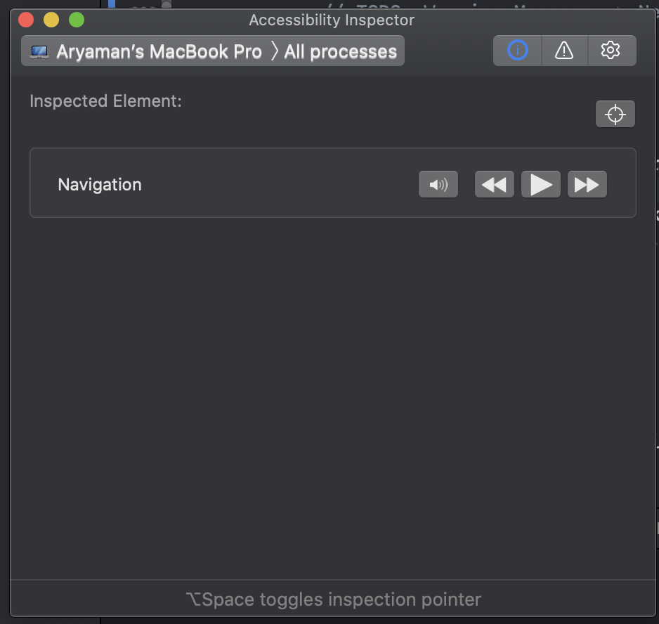
Accessibility Inspector + Audit
VoiceOver and Accessibility Inspector go hand in hand. This built-in Xcode utility allows you to step through your application in the same way a differently-abled user might.
Additionally, Accessibility Inspector comes with an audit tool that lets you -as the name suggests – perform accessibility audits of your application view by view. This makes it really easy to identify issues and triage them for later.

Environment Overrides

If you need to customize or test various scenarios at runtime, Environment Overrides is your saving grace. It’s built into Xcode and helps set your app into any number of states. You can use this to easily test dynamic text, contrast, dark mode, and much more.
Device Testing
When I first started implementing VO related tasks, it would take me a long time to get to the required view using VO gestures. So, my first solution was to use “Hey, Siri” to toggle VO as I navigated through the app. This worked well enough, but my current approach is to use the back tap feature to enable/disable voiceover at will.
This made it really easy to navigate through the app, enable VO, test, and then return to a normal navigation experience.
Misc.
- Images will not meaningfully support VO unless explicitly specified. You should use the
accessibilityLabelandaccessibilityTraitsproperty to provide the appropriate description for the image. Otherwise, consider settingisAccessibilityElementto false. - Do not include the type of control or view in the
accessibilityLabeloraccessbilityHintas this information is automatically included by iOS. - Any tappable area should be at least 44 x 44 pt.
- Some users may have difficulty making out the content on the page. If this is something you care about, consider validating your app’s contrast and inverted colors appearance.
- If your design system allows for it, use dynamic text which allows users to choose the size of textual content displayed on the screen. It helps users who need larger text for better readability. It also accommodates those who can read the smaller text, allowing more information to appear on the screen.
- Don’t shy away from custom UIs. You can convey a lot of information with
accessibilityLabelandaccessibilityTraits. Moreover, you can check if VO is running withUIAccessibility.isVoiceOverRunningand modify the behavior or views in your application as needed.
It’s far easier to add accessibility support as you go rather than add it retroactively. You don’t have to utilize all of these features in your accessibility efforts – using any subset of these features would improve the experience for your differently-abled users.
Workflow
As part of this new team, we agreed to defer all accessibility decisions and application copy to our product and design teams.
Over the course of implementing a few features, we came to a common understanding of what information the engineering team needed and how the design and product teams should provide it.
To demonstrate, let’s reconstruct Scoop’s login flow and I’ll call out exactly what we might require from our design teams.
At a minimum, the designs would need to communicate all of the accessibilityLabel text, accessibilityHints, notifications, grouping, and ordering of the various components in the view.
The following approach was heavily influenced by Capital One’s approach with some minor modifications.
In addition to the normal designs the mobile team would receive through Sketch/Figma, there should be an annotated version that specifies accessibilityLabel and accessibilityTrait values.

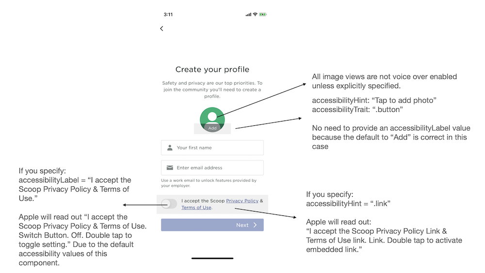
Edit: The following text should say “So, there is no additional information to provide here.”


Here’s a final deliverable from the design team. It resolves all of the ambiguity on the engineering side and ensures that the product team can verify the accessibility behavior.

If you like this post, feel free to follow me on Medium, Twitter, or check out any of my other posts.