
Recreating The iOS Timer App In SwiftUI
Today's tutorial will focus on using SwiftUI to recreate the UI and functionality of the iOS Timer.
We'll construct each of the UI components individually, build out the ViewModel, and then we'll bring everything together.
The source code for this project is available here.
Breaking Down The UI
When we look at the UI, we can break it down into 4 discrete sections:
TimePickerViewStartButton&StopButtoncontrolsCircularProgressView(visible only when the timer is active)PauseButtoncontrol (visible only when the timer is active)
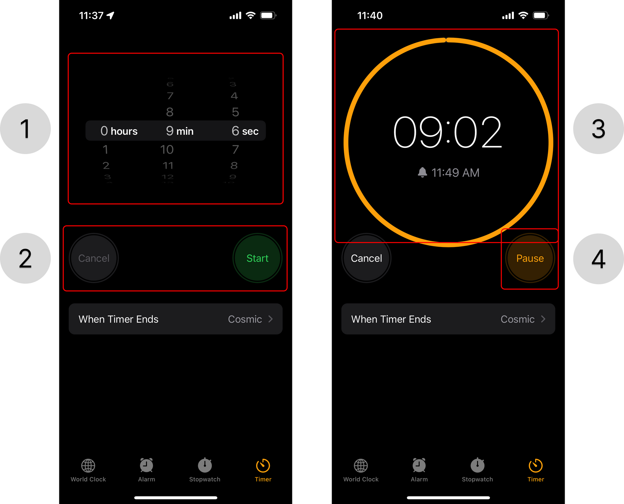
If we look at the screenshot above, we'll notice that the text in the Picker appears to be right-aligned while its accompanying label is left-aligned. Moreover, each of the Pickers for hours, minutes, and seconds occupies 1/3rd of the screen respectively, but the selected row effect is combined across all of them!
So, we'll need to create a custom multi-column Picker component.
1. TimePickerView
Since we know we'll eventually need multiple Picker columns, let's create a view to represent a single one.
Our TimePickerView will accept a title for the label on the right-hand side, a range of values to display, and a binding value that will update with the user's selection.
struct TimePickerView: View {
    let title: String
    let range: ClosedRange<Int>
    let binding: Binding<Int>

    var body: some View {
        ...
    }
}
While Apple's implementation here is fairly custom, after playing around with the implementation for a while, I was able to come up with a reasonably close approximation.
struct TimePickerView: View {
// This is used to tighten up the spacing between the Picker and its
// respective label
//
// This allows us to avoid having to use custom
private let pickerViewTitlePadding: CGFloat = 4.0
let title: String
let range: ClosedRange<Int>
let binding: Binding<Int>
var body: some View {
HStack(spacing: -pickerViewTitlePadding) {
Picker(title, selection: binding) {
ForEach(range, id: \.self) { timeIncrement in
HStack {
// Forces the text in the Picker to be
// right-aligned
Spacer()
Text("\(timeIncrement)")
.foregroundColor(.white)
.multilineTextAlignment(.trailing)
}
}
}
.pickerStyle(InlinePickerStyle())
.labelsHidden()
Text(title)
.fontWeight(.bold)
}
}
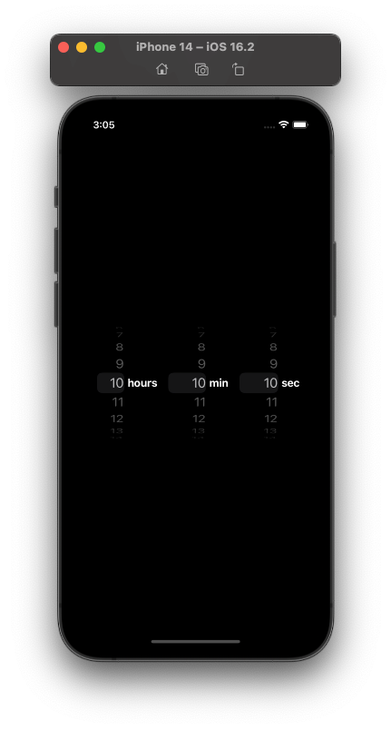
}Now, we can add this custom component to our main View:
class TimerViewModel: ObservableObject {
    @Published var selectedHoursAmount = 10
    @Published var selectedMinutesAmount = 10
    @Published var selectedSecondsAmount = 10

    let hoursRange = 0...23
    let minutesRange = 0...59
    let secondsRange = 0...59
}

struct TimerView: View {
    @StateObject private var model = TimerViewModel()

    var body: some View {
        HStack() {
            TimePickerView(title: "hours",
            	range: model.hoursRange,
                binding: $model.selectedHoursAmount)
            TimePickerView(title: "min",
                range: model.minutesRange,
                binding: $model.selectedMinutesAmount)
            TimePickerView(title: "sec",
            	range: model.secondsRange,
                binding: $model.selectedSecondsAmount)
        }
        .padding(.all, 32)
        .frame(maxWidth: .infinity, maxHeight: .infinity)
        .background(.black)
        .foregroundColor(.white)
    }
}
An alternative implementation is presented here for the multi-columnPickerview, but it's pretty involved...
It requires overlaying aHStackwith twoTextviews onto thePickerview using aZStack. Then, it sets clear text in the firstTextview to offset the position of the secondTextview and uses customalignmentGuidesto bring everything into alignment.
I was able to achieve the desired effect by simply adding a minor offset of -5 to thespacingproperty on the containingHStack.
2. Start / Stop Button Controls
To create our custom buttons, we can define a new ButtonStyle for each of the 3 variants (start, resume, pause):
struct StartButtonStyle: ButtonStyle {
    func makeBody(configuration: Configuration) -> some View {
        configuration.label
            .frame(width: 70, height: 70)
            .foregroundColor(Color("TimerButtonStart"))
            .background(Color("TimerButtonStart").opacity(0.3))
            .clipShape(Circle())
            .padding(.all, 3)
            .overlay(
                Circle()
                    .stroke(Color("TimerButtonStart")
                    	.opacity(0.3), lineWidth: 2)
            )
    }
}
I've also created CancelButtonStyle and PauseButtonStyle that share the same implementation, but with different foregroundColor and background properties.
Now, we can add them to our TimerView:
HStack {
    Button("Cancel") {}
    .buttonStyle(CancelButtonStyle())

    Spacer()

    Button("Start") {}
    .buttonStyle(StartButtonStyle())
}
.padding(.horizontal, 32)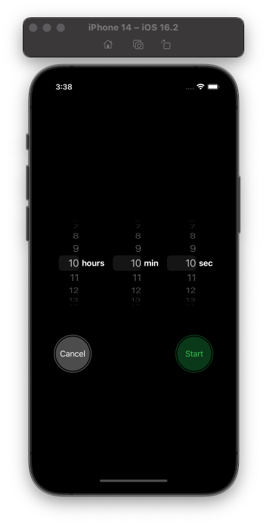
Now we're getting somewhere!
3. Circular Progress View
When we take another look at the iOS Timer app's implementation, we can see that the ProgressView consists of two components; one of them is a gray circle which becomes visible only when the orange circle fades away to reveal it.
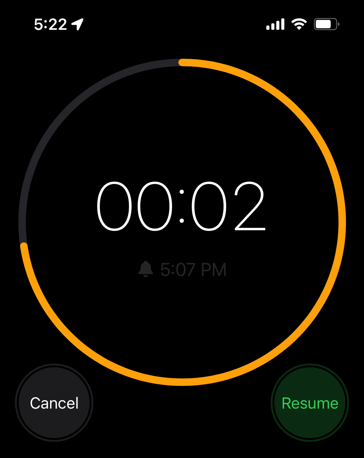
Our custom CircularProgressView is also modeled after this behavior:
struct CircularProgressView: View {
    @Binding var progress: Float

    var body: some View {
        ZStack {
            // Gray circle
            Circle()
                .stroke(lineWidth: 8.0)
                .opacity(0.3)
                .foregroundColor(Color("TimerButtonCancel"))

             // Orange circle
            Circle()
                .trim(from: 0.0, to: CGFloat(min(progress, 1.0)))
                .stroke(style: StrokeStyle(lineWidth: 8.0,
                	lineCap: .round, lineJoin: .round))
                .foregroundColor(Color("TimerButtonPause"))
                // Ensures the animation starts from 12 o'clock
                .rotationEffect(Angle(degrees: 270))
        }
        // The progress animation will animate over 1 second which
        // allows for a continuous smooth update of the ProgressView
        .animation(.linear(duration: 1.0), value: progress)
    }
}
Now, in our TimerViewModel, I've added the following properties and helper functions:
// Represents the different states the timer can be in
enum TimerState {
    case active
    case paused
    case resumed
    case cancelled
}


// MARK: Private Properties
private var timer = Timer()
private var totalTimeForCurrentSelection: Int {
    (selectedHoursAmount * 3600) + (selectedMinutesAmount * 60) + selectedSecondsAmount
}

// MARK: Public Properties
@Published var state: TimerState = .cancelled {
    didSet {
    	// Modeled as a state machine for easier testing and
        // a cleaner / more readable implementation
        switch state {
        case .cancelled:
        	// Cancel the timer and reset all progress properties
            timer.invalidate()
            secondsToCompletion = 0
            progress = 0

        case .active:
        	// Starts the timer and sets all progress properties
            // to their initial values
            startTimer()

            secondsToCompletion = totalTimeForCurrentSelection
            progress = 1.0

            updateCompletionDate()

        case .paused:
        	// We want to pause the timer, but we
            // don't want to change the state of our progress
            // properties (secondsToCompletion and progress)
            timer.invalidate()

        case .resumed:
        	// Resumes the timer
            startTimer()

            // We don't know how long we've been paused for, so
            // we need to update our ETA
            updateCompletionDate()
        }
    }
}

// Powers the ProgressView
@Published var secondsToCompletion = 0
@Published var progress: Float = 0.0
@Published var completionDate = Date.now

private func startTimer() {
    timer = Timer.scheduledTimer(withTimeInterval: 1.0, repeats: true, block: { [weak self] _ in
        guard let self else { return }

        self.secondsToCompletion -= 1
        self.progress = Float(self.secondsToCompletion) / Float(self.totalTimeForCurrentSelection)

        // We can't do <= here because we need to ensure the animation
        // has time to finish running (see .linear(duration: 1.0))
        if self.secondsToCompletion < 0 {
            self.state = .cancelled
        }
    })
}

private func updateCompletionDate() {
    completionDate = Date.now.addingTimeInterval(Double(secondsToCompletion))
}
I've also added a small extension on Int to more conveniently convert some number of seconds into a convenient timestamp format (ex. 12:23:45):
extension Int {
    var asTimestamp: String {
        let hour = self / 3600
        let minute = self / 60 % 60
        let second = self % 60

        return String(format: "%02i:%02i:%02i", hour, minute, second)
    }
}
With all of this logic in place, we can turn our attention to cleaning up the implementation of our main View.
4. Adding Pause Timer Controls
We'll start by moving the timing controls - start, pause, and resume - into their own computed property. This property will refer to model.state to determine the appropriate buttons to show.
var timerControls: some View {
    HStack {
        Button("Cancel") {
            model.state = .cancelled
        }
        .buttonStyle(CancelButtonStyle())

        Spacer()

        switch model.state {
        case .cancelled:
            Button("Start") {
                model.state = .active
            }
            .buttonStyle(StartButtonStyle())
        case .paused:
            Button("Resume") {
                model.state = .resumed
            }
            .buttonStyle(PauseButtonStyle())
        case .active, .resumed:
            Button("Pause") {
                model.state = .paused
            }
            .buttonStyle(PauseButtonStyle())
        }
    }
    .padding(.horizontal, 32)
}
We can break out our multi-column Picker and CircularProgressView in the same way:
var timePickerControl: some View {
    HStack() {
        TimePickerView(title: "hours", range: model.hoursRange, binding: $model.selectedHoursAmount)
        TimePickerView(title: "min", range: model.minutesRange, binding: $model.selectedMinutesAmount)
        TimePickerView(title: "sec", range: model.secondsRange, binding: $model.selectedSecondsAmount)
    }
    .frame(width: 360, height: 255)
    .padding(.all, 32)
}

var progressView: some View {
    ZStack {
        withAnimation {
            CircularProgressView(progress: $model.progress)
        }

        VStack {
            Text(model.secondsToCompletion.asTimestamp)
                .font(.largeTitle)
            HStack {
                Image(systemName: "bell.fill")
                Text(model.completionDate, format: .dateTime.hour().minute())
            }
        }
    }
    .frame(width: 360, height: 255)
    .padding(.all, 32)
}
Now, our body is much easier to read and understand.
var body: some View {
    VStack {
        if model.state == .cancelled {
            timePickerControl
        } else {
            progressView
        }

        timerControls
        Spacer()
    }
    .frame(maxWidth: .infinity, maxHeight: .infinity)
    .background(.black)
    .foregroundColor(.white)
}
Demo
And finally, we have a working replica of the Timer app along with a clean SwiftUI implementation:
You can find the source code here!
If you're interested in more articles about iOS Development & Swift, check out my YouTube channel or follow me on Twitter.
And, if you're an indie iOS developer, make sure to check out my newsletter! Each issue features a new indie developer, so feel free to submit your iOS apps.